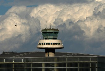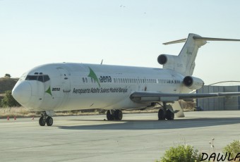

Aena, the Spanish airport operator, and Enaire, the public company responsible for air navigation, have changed logos.
The new Aena’s logo is not really a new corporate image. It is actually a redesign from the usual logo made by Javier Mariscal.
Aena’s new logo
The blue colour, which alludes to air, disappears in the brand: any matters related to the air space management have been kept by Enaire.
Enaire’s new logo
Mariscal introduced a more lighthearted typography and left green as the only colour, together with black for the association to allude to the environment.
The new logo introduction is being made little by little. Actually you may have noticed that the Aena’s press release on the Handling tender already showed the new logo. However, the Aena’s web site, at the minute we are writing this post, still holds the old brand:
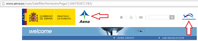
Old logos in aena.es
This slow introduction has been planned in order to save costs.
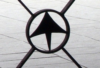
As for Enaire, now chaired by Rafael Català, they had the new logo registered last year, when the Government plans were not know yet. The brand new image for the company which is taking over the air navigation gets the entire blue colour.
Also, the typography is totally different and even has different letter stroke widths. Moreover, there is a symbol in a lighter blue which reminds the shape of a plane.
Source: Preferente.com